
BUY&SEEK: SHOPPING STREAMLINED
DESIGNING A MOBILE APP FOR BUSY BUYERS
PURPOSE
Buy&Seek tries to help busy individuals shop faster by making in-store info available proactively - enabling users to locate, confirm, & purchase products more efficiently.
TIMELINE
3-week Design Thinking sprint from March 27 – April 17, 2023.
TEAM SIZE
3 teammates divided roles by interest: 1 UX researcher, 2 UI designers. I led visual design & prototyping while contributing to UX research efforts.
USER RESEARCH & FINDINGS
We conducted 6 remote interviews, synthesized insights into an affinity diagram, and identified 4 core user frustrations:
• Wasting time or money while shopping
• Uncertainty about product availability
• Stress from store crowding
• Difficulty locating or approaching store staff
We also ran a competitive analysis of 5 diverse shopping tools. Gaps identified across competitors included:
• No live crowd tracking
• Minority of live chat or in-store assistance tools
• No real-time product inventory or integrated store mapping
These findings shaped our user persona, Eli Young, which we used to inform our design decisions.
A user scenario contextualized the problem for us to devise a journey map and user flow, modeling how Eli Young might engage with the app at each juncture, surfacing usability concerns early.
DEFINITION & IDEATION
Using “I Like, I Wish, What If” brainstorming, we organized 45 ideas into an affinity map, then leveraged a prioritization matrix to isolate 3 high-impact, low-complexity features:
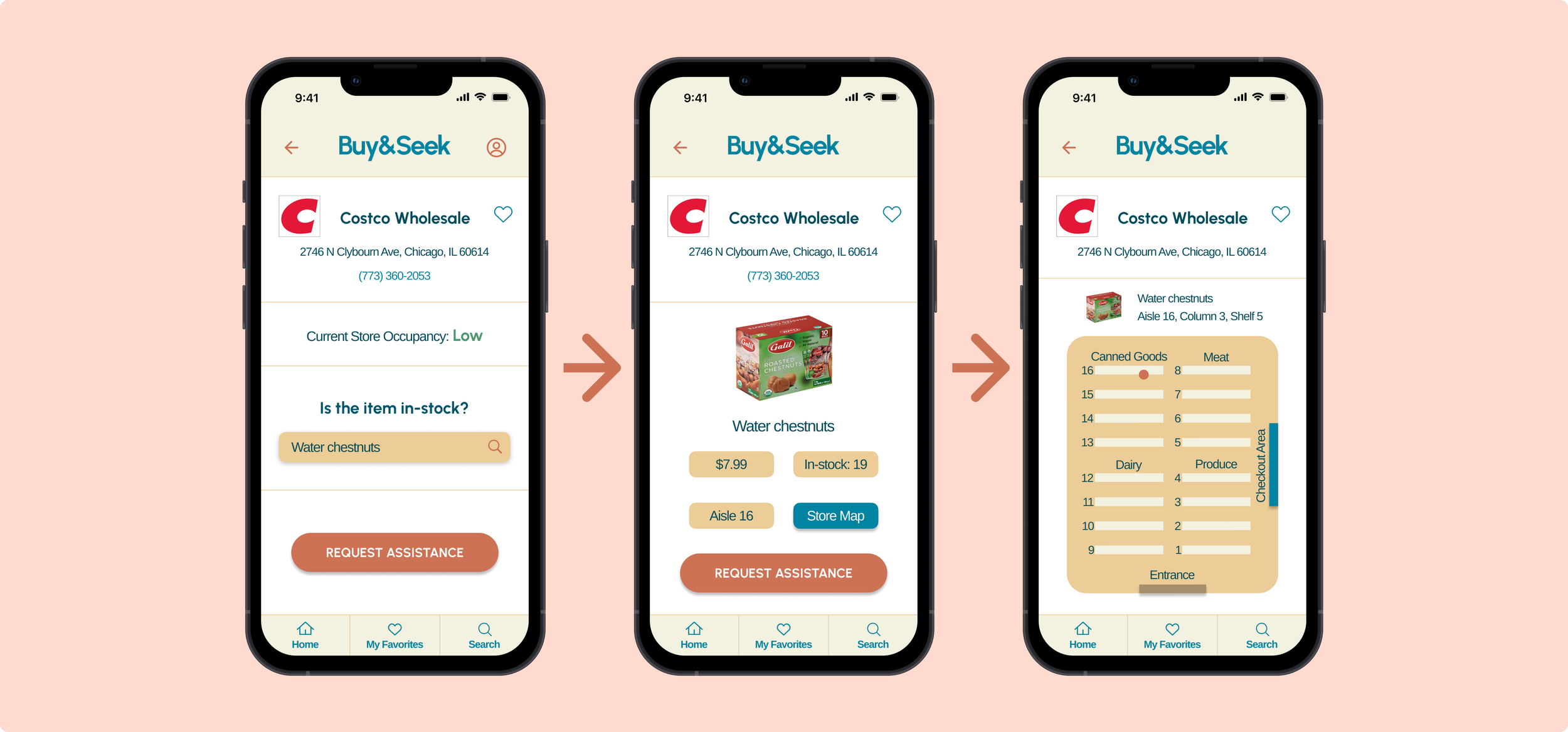
• Searchable in-store inventory
• Live store busyness indicators
• In-app live chat with store associates
Thus, our problem statement became: We believe that enabling busy individuals to proactively look up product availability, location, store traffic, and assistance, will streamline their shopping experiences by increasing efficiency.
INTERACTIVE PROTOTYPE
We followed an iterative prototyping approach using sketches, wireframes, & interactive builds:
• Lo-fi prototype: Combined top-voted features from team sketches, used to validate navigation & user interactions.
• Mid-fi prototype: Applied iOS Human Interface Guidelines, integrated user feedback, and reflected a refined style tile.
• Hi-fi prototype: Built from a comprehensive style guide, used to code a functional front-end simulating one complete user flow.
Prototypes evolved through user testing & direct iteration, resulting in a solution tailored to real user needs.
USABILITY TESTING & FINDINGS
We ran remote guerrilla tests using Zoom & Google Meet:
• Lo-fi testing (5 users): 93.3% avg task completion
• Mid-fi testing (4 users): 100% task completion
Lo-fi feedback revealed issues with unclear wording and a lack of visual hierarchy.
Mid-fi feedback concerned the interactive hierarchy of primary features and an incomplete store associate interaction.
INSIGHTS & OUTCOME
Buy&Seek addressed the time-draining friction of in-person shopping through user-led design decisions.
Lessons learned:
• Dividing tasks by interest built trust & individual ownership
• Testing at each stage improved design efficiency
• Had time allowed, we would have prioritized a “Favorites” feature for frequent stores
Future steps could include:
• Online store integration
• Packaging features into SaaS APIs for retailers
• Expanding into hybrid digital-physical retail experiences
PROJECT SNAPSHOT
DESIGN PROCESS
Our “Design Thinking” process involved user research, ideation of solutions, iterative prototyping and testing, and coding a final front-end design. Our team of three was tasked with researching, prototyping, testing, and validating a brand-new mobile app solving a clearly identified need in users’ daily lives. We recognized shopping as a task that is commonly time-intensive and addressed it directly.
MY INPUTS
• Designed 4 prototypes: lo-fi, mid-fi, hi-fi, & coded front-end
• Collaborated on 11 UX artifacts, such as Affinity Diagrams and a User Persona, to guide design decisions.
• Conducted 2 usability tests & helped reframe insights into actionable design decisions
• Defined user flow logic to reduce cognitive friction & support feature prioritization
TOOLS USED


Copyright © 2015-2025